Correct
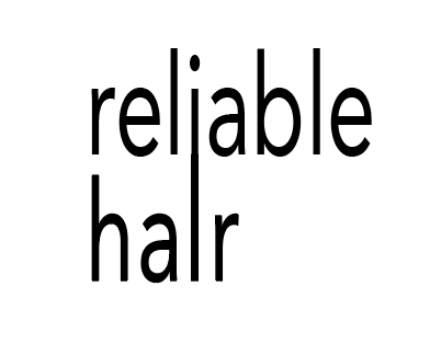
Keep the main logo black with clear spacing between each letter. This keeps it clean and professional.
Learn about the logo, color, layouts, typography, graphical elements and other accessible areas.
Keep the main logo black with clear spacing between each letter. This keeps it clean and professional.
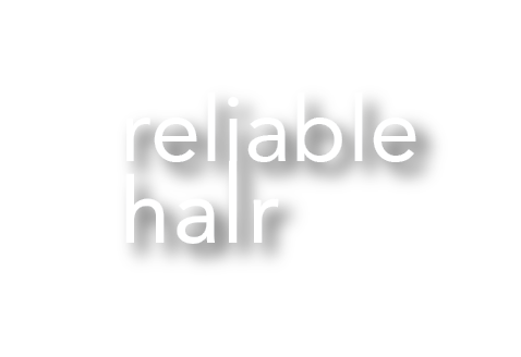
Keep secondary logo white and use along darker backgrounds for a nice clean contrast to keep it easy to read.
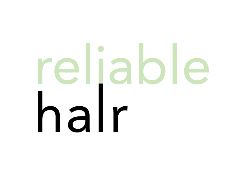
For the Impact logo keep this black or white with no drop shadows, gradient, color changes, or spacing errors.
Do not change color of section of logo. Only black and white for whole Reliable Hair/ Impact logo.
Do not add drop shadow to any logo. this takes away and makes it harder to read.
Do not stretch letters. This makes it hard and less legible to read.
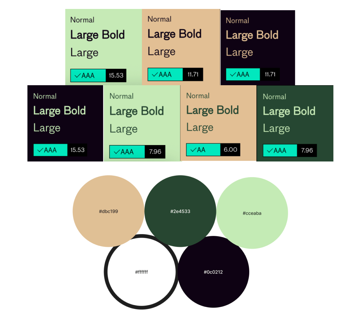
Reliable Hair uses a easy, clean amount of color within the whole brand to accomplish the minimalistic aesthetic they , as a company, are trying to with hold. By using this color palette the brand feels cohesive as a whole and not too overwhelming to a customer.
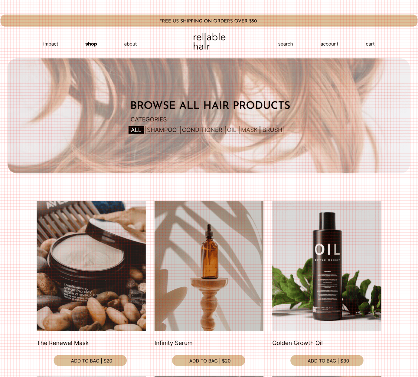
Reliable Hair uses clean, evenly distributed spacing between buttons and products. A grid is used to neatly arrange components, products, type and more. Auto layout is also used for dynamic grid layout.
We use two specific typefaces: Inter and Josefina Sans
Display/ Heading (48-98px): Inter
Subhead (16-32px):
Josefina Sans
Body (16-24px):
Inter
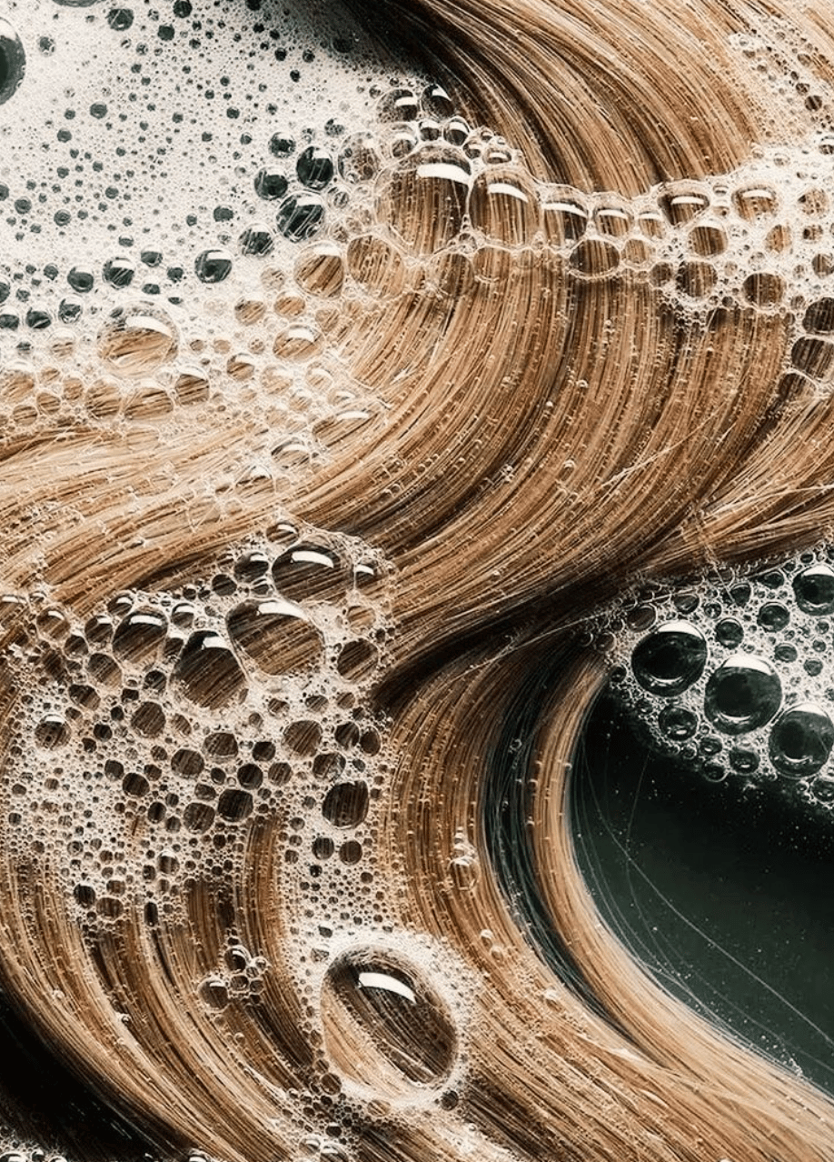
We use a combination of real life imagery of people using our product and the product itself to show our customers the connection we want everyone to have with the brand.
Learn about the logo, color, layouts, typography, graphical elements and other accessible areas.
Keep the main logo black with clear spacing between each letter. This keeps it clean and professional.
Keep secondary logo white and use along darker backgrounds for a nice clean contrast to keep it easy to read.
For the Impact logo keep this black or white with no drop shadows, gradient, color changes, or spacing errors.
Do not change color of section of logo. Only black and white for whole Reliable Hair/ Impact logo.
Do not add drop shadow to any logo. this takes away and makes it harder to read.
Do not stretch letters. This makes it hard and less legible to read.
Reliable Hair uses a easy, clean amount of color within the whole brand to accomplish the minimalistic aesthetic they , as a company, are trying to with hold. By using this color palette the brand feels cohesive as a whole and not too overwhelming to a customer.
Reliable Hair uses clean, evenly distributed spacing between buttons and products. A grid is used to neatly arrange components, products, type and more. Auto layout is also used for dynamic grid layout.
Typography follows semantic HTML structure, using H1 for page titles, H2 for sections, and paragraph styles for body text.
Display/ Heading (48-98px): Inter
Subhead (16-32px): Josefina Sans
Body (16-24px): Inter
We use a combination of real life imagery of people using our product and the product itself to show our customers the connection we want everyone to have with the brand.
Learn about the logo, color, layouts, typography, graphical elements and other accessible areas.
Keep the main logo black with clear spacing between each letter. This keeps it clean and professional.
Keep secondary logo white and use along darker backgrounds for a nice clean contrast to keep it easy to read.
For the Impact logo keep this black or white with no drop shadows, gradient, color changes, or spacing errors.
Do not change color of section of logo. Only black and white for whole Reliable Hair/ Impact logo.
Do not add drop shadow to any logo. this takes away and makes it harder to read.
Do not stretch letters. This makes it hard and less legible to read.
Reliable Hair uses a easy, clean amount of color within the whole brand to accomplish the minimalistic aesthetic they , as a company, are trying to with hold. By using this color palette the brand feels cohesive as a whole and not too overwhelming to a customer.
Reliable Hair uses clean, evenly distributed spacing between buttons and products. A grid is used to neatly arrange components, products, type and more. Auto layout is also used for dynamic grid layout.
Typography follows semantic HTML structure, using H1 for page titles, H2 for sections, and paragraph styles for body text.
Display/ Heading (48-98px): Inter
Subhead (16-32px): Josefina Sans
Body (16-24px): Inter
We use a combination of real life imagery of people using our product and the product itself to show our customers the connection we want everyone to have with the brand.